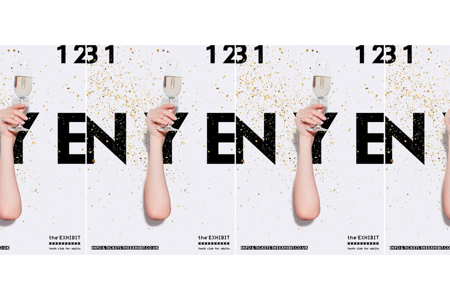
The Exhibit Stationery
Targeting young adults, The Exhibit is a venue/bar/club/restaurant/ in East London, Balham.
It is a brand with a lot of potential and they gave me free rein on design concepts which sometimes can be challenging or tricky because of the limits or requirement’s are not set. On the flip side it has allowed me to create and show off the best of my design abilities.
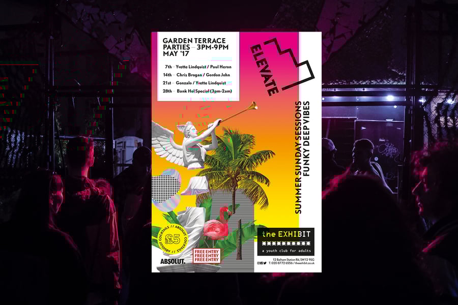
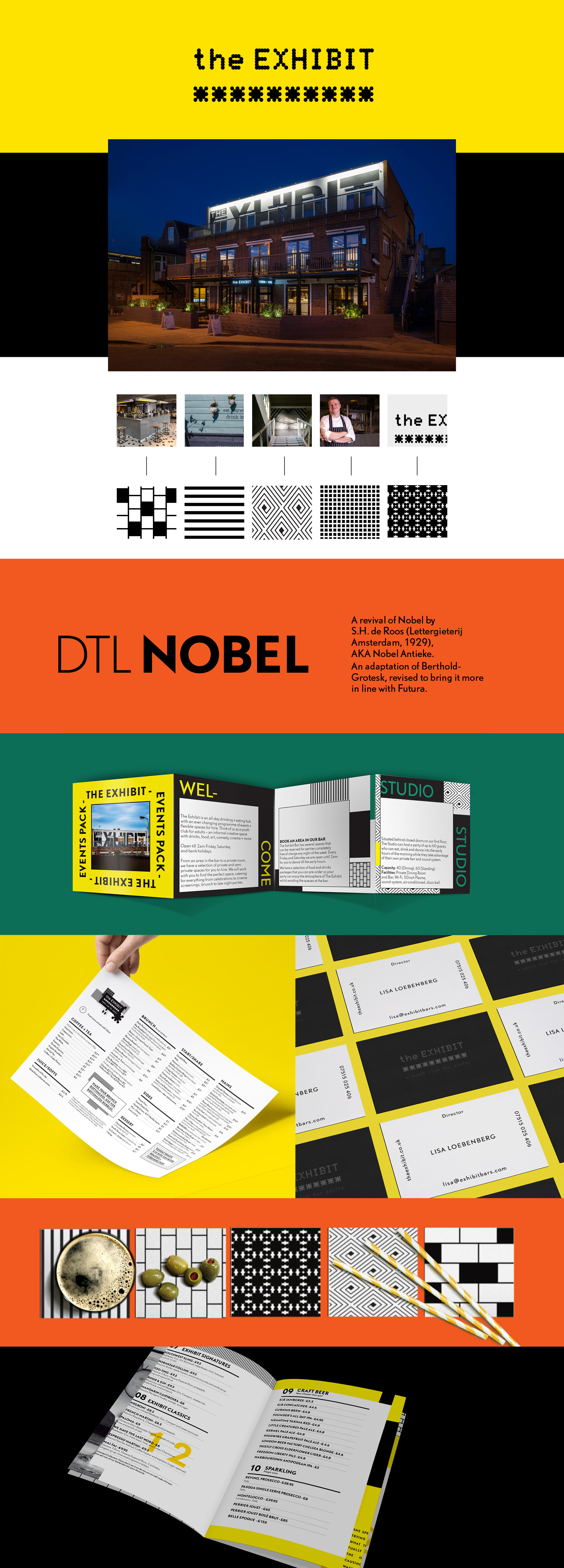
It was a brand with many issues regarding to the incoherence’s in its communications. From inappropriate use of fonts to the different styles for posters and flyers and the big signage in the facade with a different logotype.
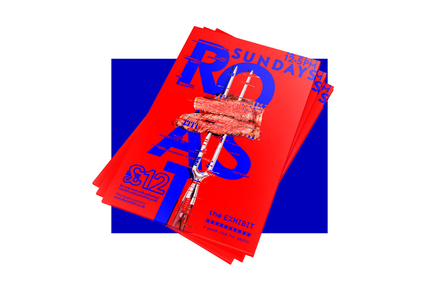
I had my first meeting with Lisa; one of the directors and Greg the general manager. We agreed that we needed to unify the styles and make the visual communication stronger and punchy. We were looking for a bolder, slightly unique and quirky type of look and feel, more contemporary and aggressive. Part of that inspiration was the art school Bauhaus and The Exhibit's own building.
I put some images together in a mood board to reflect those previews key words. I also made a short typeface catalogue showcasing options to change their actual font for a new one, a more impersonal and simple one, which perfectly matched the massive wording in the facade. That font is Nobel; a Dutch geometric sans-serif typeface, released in 1929, very well known in the Bauhaus time.
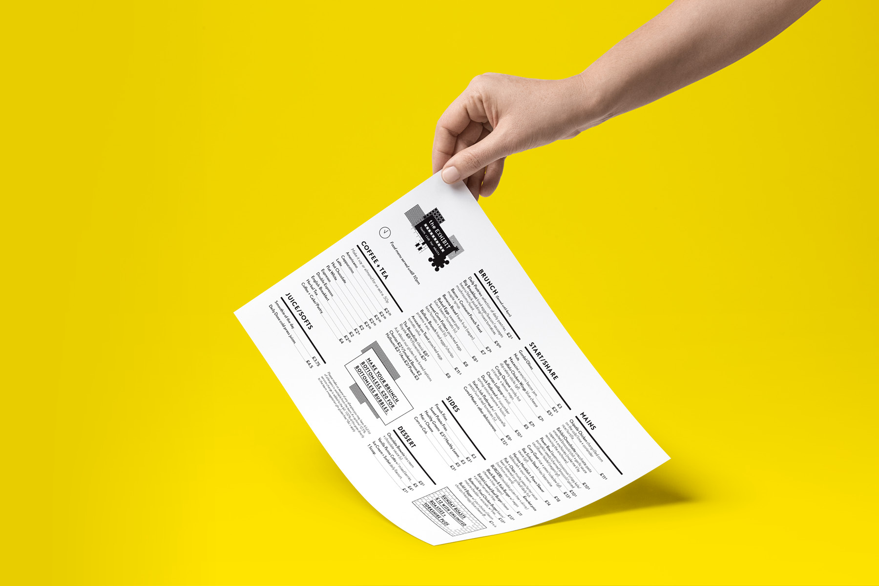
Once we all agreed on the direction we wanted to take, I started to work on the basic stationary and the menus. I must admit that my main influence was the building, big and bold typefaces inspired by the main signage in the facade. Punchy visuals with a strong and solid character.
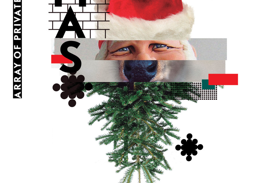
To make the branding more unique I created a set of patterns based in textures that can be found in furniture decor and walls of the venue. In terms of the colours, we kept the yellow as the main one and added two extra seasonal palettes which will be switched every season and used in certain materials as the menu.
Although the full rebranding process is not finished, it is a fantastic beginning and I’m very happy as they are with the results.