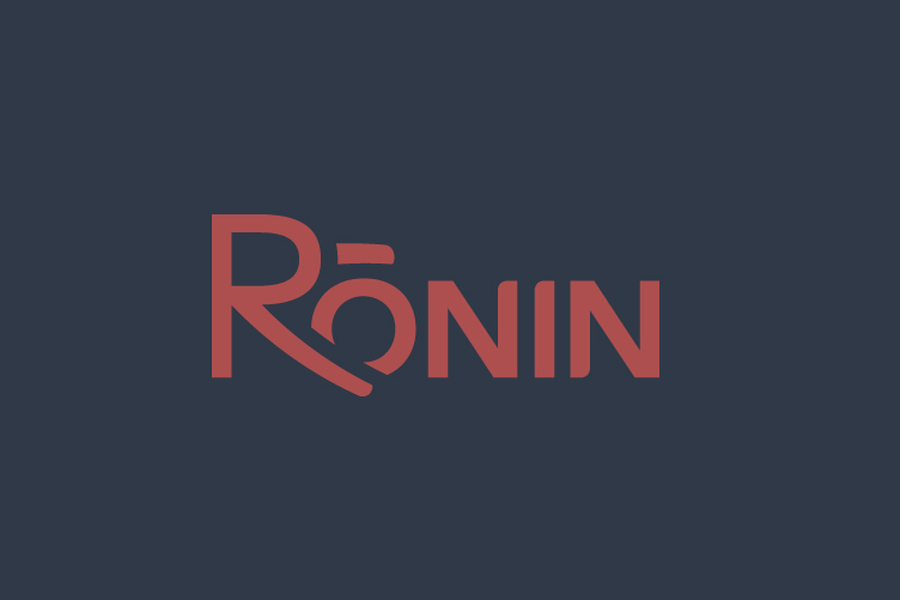
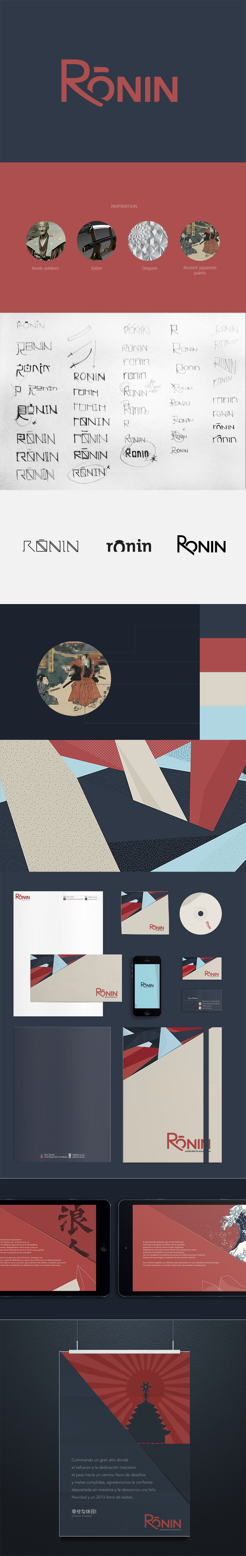
Ronin
Ronin is Japanese and is the name for ex-warrior samurais. My intention was to create a logo with shapes that link strongly to the samurai culture. The reason that the foot of the ‘R’ is longer is because it is supposed to be a saber cutting the ‘O’. I experimented with diagonal lines and with origami inspired patterns, using straight, rigid lines. The colour palette was inspired by ancient Japanese paintings.